Increasing Shares of Curated Packages
Background
Curated Packages (now known as “Storyboards”) are collections of hand-picked articles by Flipboard editors or publishers. One of the ways to help drive growth and revenue is for Flipboard users to share content, or more specifically Curated Packages, with others.
The goals of this project were to have
1) More unique users tapping the “Share” button (not just the same person sharing multiple times) and
2) More users actually sharing Curated Packages
Evaluating the Share Experience
First, I evaluated the current share experience as a whole, not just focusing on the in-app experience. Even if the new design makes it easy and simple to share while in the app, it is important to ensure this applies to the whole sharing loop.
For example, are there other issues around sharing that could be improved? What does it look like for someone sending and receiving a Curated Package?
While the sender sees an image, title of the Curated Package, and that it's from Flipboard, the receiver just sees a link. It would be confusing to receive a message like this, and would probably make someone think it is a virus or spam link.
At a minimum, it should at least look like how it does to the sender, with an image and a title. I brought this up in a meeting with the Head of Engineering, who wasn’t aware of the issue. It was later resolved and discovered that it was occurring due to a loading issue.
In addition, since each Curated Package already has an introductory paragraph, it would be helpful to include that as a description to provide more context to the receiver.
Understanding the Environment
Within Flipboard, in addition to Curated Packages, there are also Magazines, which is similar yet slightly different. Since they have different characteristics, they also look different in the app.
While this project was specifically related to sharing Curated Packages, there have been ongoing discussions about whether Curated Packages and Magazines should be distinct and continue to look different, or whether they should merge into one identity.
Magazines
Similarities
• Collections of articles
• Can be shared
Differences
• Created by any user
• Can have infinite number of articles
• Can be constantly updated
• Can follow Magazine
Curated Packages
Similarities
• Collections of articles
• Can be shared
Differences
• Can only be created by Flipboard editors or publishers, not users
• Has finite number of articles
• Is not updated once published
• Can follow publisher
I wanted to keep these similarities and differences in mind for when I start to brainstorm different ideas, and aimed to propose a solution that would also work with Magazines, in the event they were to merge into one identity in the future.
Brainstorming Ideas
In the current design, the “Follow” button is the most prominent CTA since it is a red button, while “Share” is only an icon.
How might we make “Share” more prominent? The overall theme in brainstorming ideas was to make “Share” more prominent and “Follow” to be the secondary action.
Direction #1
One direction I explored was to make the “Share” button more prominent and persistent, and change from a “Follow” button to text.
Direction #2
To allow more room for the buttons and the ability to make them persistent, I moved the navigation bar from the bottom to the top. This would also allow the “Share” button to be larger.
Direction #3
Since we want users to continuously discover great content, I explored adding carousels at the end of these curated packages.
By showing more content that the user will find interesting, hopefully this will increase the probability they will share a Curated Package.
Direction #4
Encourage users to share by showing how many others have shared the Curated Package or using a tooltip.
Deciding on Designs
After sketching and wireframing different designs, I put together a presentation deck and presented it to the design team for feedback. I went over the goal of this project, an evaluation of the current sharing experience on iOS and Android, and finally my designs.
I made iterations based on the feedback, then presented the designs to the Head of Engineering for further feedback and to decide which designs to test. With the final round of iterations, we then met with the Software Engineer who would be responsible for building out the design.
Based on discussions, the final designs we decided to test mainly focused on having a persistent or large “Share” button. This was to avoid having too many different variables when testing.
The following designs were included in the experiment:
1) Control - “Share” icon and “Follow” solid button
2) Treatment 1 - “Share” icon and “Follow” text button
3) Treatment 2 - “Share” button and “Follow” text button
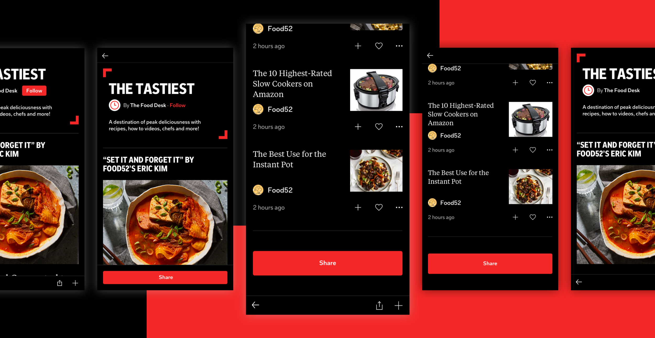
4) Treatment 3 - Large “Share” button at bottom of feed and “Follow” text button
5) Treatment 4 - Persistent “Share” button and “Follow” text button
6) Treatment 5 - Persistent “Share” button that blends into end of feed and “Follow” text button
Results
Treatment 3, resulted in a 25% increase in “Share” taps and 14% increase in shares. While other treatments, such as the ones with a persistent “Share” button had up to 150% increase in “Share” taps, it resulted in a comparable percentage of actual shares.
However, we noted that changing “Follow” from a solid button to a text button had a larger than expected negative impact. While we want to drive shares, we do not want an almost 50% decrease in follows.
As a result, it was decided that Treatment 3, and changing the “Follow” text button back to a solid button would be implemented and was subsequently shipped on iOS and to be shipped on Android.
